Jacob Schneider

Overview
Pacific Vista Landscape Services needed a modern, professional website to better represent their 30+ years of experience and attract higher-value commercial clients. The existing site lacked structure, visual hierarchy, and clear calls to action. This redesign focused on improving usability, trust, and conversion.
Roles and Responsiblities
-
Oppurtunitity Walkthrough
-
Site Map
-
Competetive Analysis
-
Prototype
-
Mid Fidelity Presentation
-
Wix Site Developer
-
Final Site Presentation
Our Goal
What I aimed to achieve:
-
Increase client trust and perceived professionalism
-
Clearly communicate services and expertise
-
Improve navigation and user flow
-
Increase contact form submissions
-
Create scalable design system for future growth


The Problem
What wasn’t working:
-
Outdated design that didn’t reflect quality work
-
Confusing navigation and unclear services
-
Weak brand identity
-
No clear call-to-action for leads
-
Poor mobile experience


Stakeholder Interview
I conducted stakeholder interviews to understand both business goals and user needs.
What I Learned:
-
The top priority was to build trust and professionalism, not flashy design
-
The site needed to feel clean, modern, and easy to navigate
-
Mobile usability was essential, reinforcing a mobile-first approach
-
The primary conversion flow was simple but unclear:
User contacts company → company creates a bid -
Target users often compare competitors before reaching out
Primary audience:
-
Property managers
-
HOAs
-
Healthcare and senior living facilities
Key services:
-
Commercial landscape maintenance
-
Tree trimming
Major point of confusion,
Users mistakenly thought services were residential
Competitive Analysis:
Stay Green
-
Strong, professional visuals with polished imagery and clear branding
-
Builds trust through real project photos, videos, and detailed service explanations
Transparent contact and bid process with clear calls to action -
Highlights credibility with awards, certifications, and associations
-
Emphasizes company culture and recruitment to humanize the brand
SCV Landscaping
-
Website feels outdated with weaker visual quality and inconsistent layout
-
Limited content depth, especially in services and project examples
-
Minimal trust signals (few reviews, awards, or credentials highlighted)
-
Basic contact functionality without strong user guidance
-
Overall lower perceived quality compared to competitors
Kathy’s Landscaping
-
Professional but slightly cluttered visual design, with inconsistent hierarchy
-
Strong service breakdown across multiple pages, but navigation feels fragmented
-
Heavy use of stock images reduces authenticity
-
Contact process is accessible but spread across multiple touchpoints
-
Includes reviews, but lacks strong storytelling or differentiation
Enhanced Landscape
-
Clean, professional design with strong use of color and layout consistency
-
High-quality, authentic visuals including drone photography and real projects
-
Clear service explanations with a logical flow
-
Showcases company scale, team, and capabilities effectively
-
Includes some reviews and credibility markers, but could expand further
Overall
Takeaways
-
Authentic visuals and real project content are key to building trust and perceived quality
-
Clear service breakdowns and streamlined contact flows improve usability and conversions
-
Credibility signals (reviews, awards, associations) differentiate strong competitors from weaker ones

Original
Website Walkthrough

Homepage
About Us & Leadership
Careers
Services
Blog & Articles
Cluttered layout, weak hierarchy, and missing trust signals reduce first impression and professionalism.
Lacks depth, credibility, and functional leadership content, weakening trust and brand story.
Vague content, generic visuals, and poor structure make the page unclear and unengaging.
Inconsistent design, errors, and cluttered UX reduce credibility and usability.
Inconsistent design, errors, and cluttered UX reduce credibility and usability.
Key issues:
Inconsistent design, glitches, and usability issues weaken overall user experience and trust.
Sketches


Homepage Sketch
The goal was a clear call to action to request a quote, easy-to-find testimonials for added legitimacy, a reference to 30 years of service, and a visually impactful hero image. During the stakeholder presentation, they wanted the text to mention that it is commercial landscaping, as clients often assume it is residential.


About Us Page Sketch
The About Us page was designed to instill in clients who may be hesitant and want to know more about our business. We highlight the journey of a father-son team that grew their venture into a respected company recognized for its quality and commitment. It features some of the leadership to put a face to the business and talks about the company values


Services Page Sketch
Our Services page is designed with clarity in mind, featuring a well-organized list of offerings grouped by similarity. Each service paired with intuitive icons, allowing for quick differentiation and a seamless browsing experience. This user-friendly layout ensures that you can easily find exactly what you need without any distractions.
Low Fidelity Prototype
A clickable prototype built using Figma. It has no color and repeated examples as placeholders. This prototype was used in usability testing and stakeholder presentations.

The 5-person icons show the seats available, the counselor's rating, and specialties. Clicking the arrow brings them to the reserve page, and the top right icon goes to the filters page.

The text sizing was a issue here and the stakeholders want to focus less of the family busniess asspect and more on

The Services page was simplified to make it easier to understand and quickly scan through the information. Client wanted a few services to change around in this section
Bringing My Design Into Wix

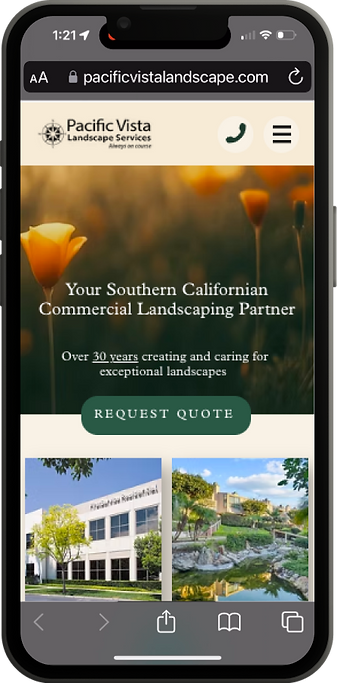
Home Page
A simple California native poppy plant was used as the hero image, and a quote was shown. The Quotes were not able to scroll horizontally

About Page
A tree silhoette was used instead of a image to make the page feel cleanier and less busy

Services Page
A box was placed around the services and the icons were centered as it looks odd and unbalanced with it on the left.
Site Analytics
We are analyzing the KPIs before and after the website edits to assess the impact our changes. This allows us to observe how our modifications have positively influenced the site's performance. By evaluating these metrics, we can gain valuable insights into the effectiveness of our enhancements.
Bounce
Rate
Month of
April 2025
Month of
April 2026
84%
84%
69%
Avg. Pages
per Session
1.2 pgs
2 pgs
Avg. Session
Duration
4m 36s
6m 33s
Home Page
Views
88
363
Contact Form Submitions
94
102
Key Takeaways
We are analyzing the KPIs before and after the website edits to assess the impact our changes. This allows us to observe how our modifications have positively influenced the site's performance. By evaluating these metrics, we can gain valuable insights into the effectiveness of our enhancements.

My Personal Takeaways and Possible Future Steps
The redesign of the Pacific Vista Landscape Services website was an incredibly rewarding learning experience that helped me grow as both a designer and collaborator. Working closely with stakeholders throughout the project taught me the importance of iteration, communication, and balancing creative vision with business goals. One of the most meaningful parts of the project was seeing the real-world impact of the redesign through improved engagement metrics and hearing positive feedback directly from clients. It was exciting to create a more polished and professional digital experience that better reflected the quality of the company’s work.
The development stage in Wix ultimately took much longer than I originally expected, but the process was worth it to see the final vision come to life. Refining layouts, adapting designs within platform limitations, and continuously improving the experience gave me valuable hands-on experience in both design and implementation. Looking ahead, I would like to continue testing and analyzing the website further, as user testing and feedback were somewhat limited during the project. Future improvements would focus on gathering more user insights and refining the experience through continued iteration and research.