Overview
I improved the user interface of SCV Water, a local government water agency, by redesigning the onboarding flow, making it more intuitive, and reducing users' need to seek assistance from customer service.

Roles and Responsiblities
-
User Flow Diagram
-
Heuristic Evaluation
-
Site-Mapping
-
Micro Interaction Animations
-
Icon Design
-
Style Guide
-
Preference Testing
-
First Click Testing
-
Designing New User-Interface
Team and Timeline
Over four months, I undertook a personal project to develop, produce, and evaluate prototypes for an interactive high-fidelity onboarding process to facilitate the initiation of water service for new homeowners.
Our Goal
SCV Water’s problem is that its website feels overwhelming with an unusable and confusing layout.
Our goal is to create and research a clickable, high-fidelity prototype that feels more approachable and easy to navigate.
User Flow
Scenario: A First-Time Homeowner needs to start water service with SCV Water Agency for their new home because they have never done it before they are worried they will make mistakes.

While the user flow diagram appears straightforward, the existing design faces challenges due to the abundance of options. Notably, the absence of an online form requires customers to call a designated number. As part of this project, we are addressing this issue by designing an efficient online form for enhanced user convenience.

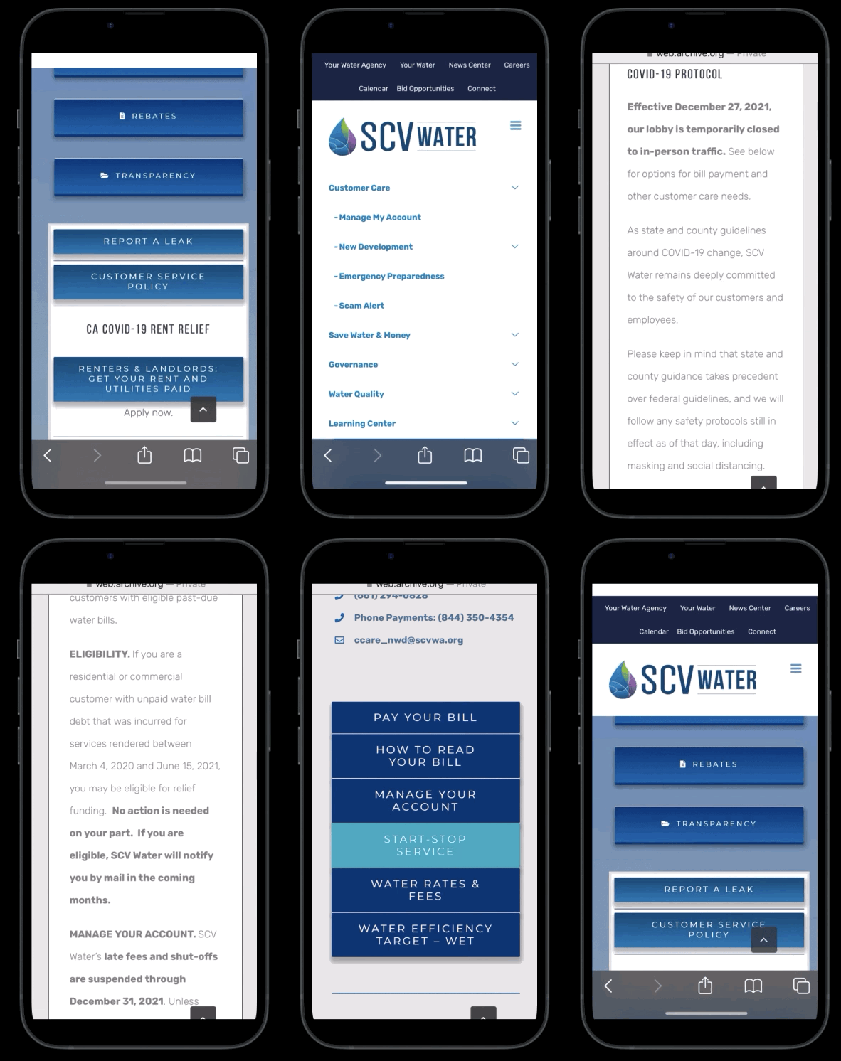
Walkthrough of Existing Navigation for Mobile
New customers are burdened with overlooking several frustrating experiences on the site, including needing to:
-
Deal with glitching navigation quick links
-
Missing images, and text-heavy information
-
Know to scroll to the bottom of the page to Start/Stop the service
-
Sort through several other distracting buttons/links
Personally, this design overwhelms me and makes it challenging to locate anything on the site. As a result, the site's useful tools and information become practically obsolete due to the struggle with the layout.
Heuristic Evaluation
Involves a checklist of design principles or heuristics aimed at promoting better usability and user experience.
The most common Heuristic violation was Consistency and Standards. The navigation interface changes several times throughout the flow.
Home Page
Analysis
Customer Care Page
Analysis
Start
Service
Page
Analysis

Three apperant rows of navigation overwhelm users
Important articles are not visible
Unused section with no apparent function
The largest section on page is a 200+ Pdf of meeting notes
Social media has a lot of content but is not featured

Green gradient overlay changes navigation confusing users
Asymmetrical design for low priority links at the top of the page
Image takes up a majority of the limited space before the fold
Important notices are below the fold and do not stand out from the rest
Pay bill button is listed twice
Social media has a lot of content but is not featured

The image is missing leading to a white banner obscuring navigation and title
Needed information
for a possible form
Have to call a number rather than use an online form
This page is the only one that has a return to customer care button
Usability Issue Prioritization Matrix
Placed issues on a grid from low to high Impact vs. low to high complexity. To ensure high impact low complexity issues get fixed first.
The main issues needed to fix include:
-
Fix apparent visual glitches
-
Redo confusing navigation
-
Change layout to reprioritize relevant links and information
Original Desktop
Analysis
Site Maping


Overwhelming Navigation Sitemap
12 Navigation Tabs on two rows with Secondary and Tertiary tabs on both rows. Several of these tabs open on the same page. A neuro-typical brain can only hold 5-7 concepts at a time. So it's easy to get lost in this navigation.
Navigational Recommendation
Issues
-
Close to 40% of navigation leads to redundant links that open the same page but scrolled down
-
12 tabs under two navigation systems both with secondary links, is too overwhelming
Changes
-
Combined similar Navigation tabs reducing 12 tabs into 6 easy-to-understand categories Your Water Agency, Connect, Customer Care, Water Quality, and Learning Center.
-
Removed dropdown links two collum card of links
Original Style Guide
I developed an original style guide to harmonize and enhance the visual and functional elements of the water agency's existing website, ensuring a cohesive and user-friendly online presence.
.png)
Micro Interaction Animations
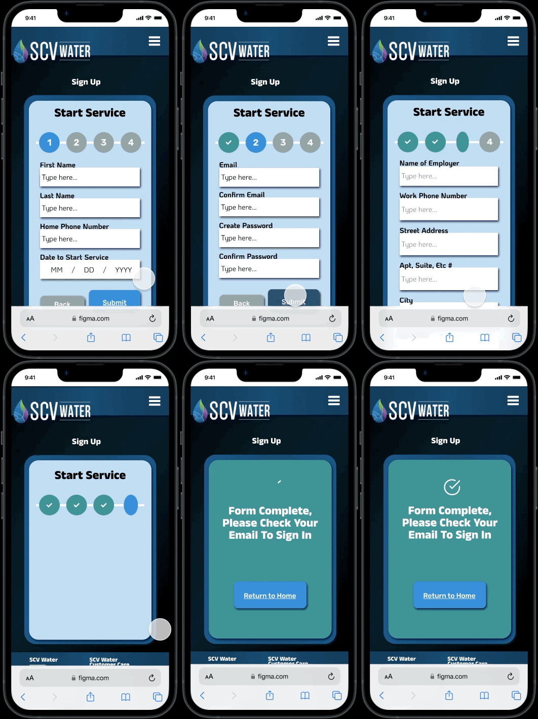
How can you make a long-form more engaging?
By providing an estimated time frame, such as the four clear steps you see here, and incorporating subtle micro-interaction animations to infuse some enjoyment into what can otherwise be a tedious experience. In this example, I implemented a playful flip animation for the step circles as users progress through the form.
Personally Designed Icons
Designing icons for the water agency simplified complex concepts, conveying essential information clearly to empower informed decision-making and enhance the overall user experience for stakeholders.
Applying Gestalt Design Principles
Applying Gestalt design principles helps create cohesive and visually appealing compositions by leveraging the innate human tendency to perceive elements as unified wholes rather than isolated parts.
.png)

These Options Won't Reach Desired Page
Usability Hub
First Click Testing
I wasn’t confident. I presume you would go to customer care to sign up. There was also a ‘connect’ and ‘your water’ section...”
Comment Original Design Tester
Analysis of the First click usability test revealed that a new user would find starting their service easier with my layout design, with only 60% of participants choosing the correct button on the original homepage, while 99.9% of tested users reached the sign-up page for my suggested design.

Preference A/B Testing
.png)
Hypothesis:
By simplifying the platform's navigation and reducing its complexity, we anticipate that users will find it more organized and user-friendly, ultimately improving overall user satisfaction and engagement.
Results:
-
There was a 67% preference for the updated navigation. However, more of a preference is needed to be statistically significant.
-
Of the 67% that preferred updated navigation, 88% of them mentioned it feeling more organized.
-
Further testing is needed. It could be due to many differences between the original and mockup.
Re-Design Reasoning
In redesigning the government water agency's website, my primary focus was on enhancing user experience and visual appeal. The initial challenge was to prevent viewers from feeling overwhelmed by the abundance of information and buttons, so I organized and prioritized sections strategically.
Transitioning seamlessly from desktop to mobile was crucial, and I accomplished this by adopting a card-based layout that maintains clarity and consistency across devices. Additionally, I introduced icons to buttons, enhancing user understanding of their functions.
Aesthetically, I aimed to convey the agency's mission by refreshing color schemes and introducing new images that radiate a sense of clean water and professionalism. Lastly, I rounded corners throughout the design, which contributed to a more tranquil and approachable aesthetic, effectively counteracting the sharpness of the original design.


